
A star map looks, at first glance, like a really pretty circle of dots. It is that. It’s also a precise, structured diagram of the sky from one specific spot at one specific moment.
Once you know what the parts mean, the dots start to read like a photograph. The horizon, the directions, the brightest stars, your familiar constellations — all sitting where they actually sat that night.
Here’s how to read one, in plain language, with no astronomy background needed.
The basic anatomy of a printed sky
Most personalized star maps are drawn as a circle, even when the poster itself is a heart, a square, or a full rectangle. The circle isn’t decorative — it’s the shape of the sky from one viewpoint.
Imagine you’re lying on your back in a field, looking straight up. The sky over you forms a giant dome. If you flatten that dome onto a piece of paper, you get a circle.
The center is straight up
The exact middle of the circle is the spot directly above the observer’s head. Astronomers call this the zenith.
A star drawn near the center of the map was high in the sky. A star drawn near the edge was low to the horizon.
The edge is the horizon
The outer rim of the circle is the horizon — the line where the sky meets the ground all the way around you. Anything past the edge was below the horizon and wouldn’t have been visible.
That’s why a star map shows only a fraction of all known stars. Half the universe is, at any given moment, hidden behind the Earth itself.
The compass directions
North, south, east, and west sit on the edge of the circle. Most star maps don’t label them explicitly because the text underneath orients you, but they’re consistent.
On a Northern-Hemisphere map, north is typically at the top of the circle and south at the bottom — the opposite of a road map, because you’re facing up, not down.
On a Southern-Hemisphere map, the convention flips. South is at the top, because that’s where the most-famous southern stars live.

Finding the brightest stars
On a real night sky, your eye finds the brightest stars first and uses them as anchors. A star map mimics that.
Why some dots are bigger than others
Star size on the map corresponds to the star’s brightness, not its actual physical size. Bright stars are drawn as larger dots; dim stars are drawn as small ones.
This is the same trick the eye uses naturally. Sirius looks “bigger” than a background star, even though it’s not — it’s just much brighter.
The few anchor stars worth knowing
From the Northern Hemisphere, a handful of bright stars carry most of the recognition work:
- Sirius— the brightest star in the entire night sky, in Canis Major. Visible from most of the world during winter evenings.
- Vega— the bright blue-white star high overhead on summer nights from the Northern Hemisphere.
- Arcturus— bright and orange, visible from the Northern Hemisphere in spring and summer.
- Capella— a brilliant golden star high in the northern winter sky.
- Polaris— not the brightest, but the most useful. The North Star sits almost exactly at the celestial pole.
From the Southern Hemisphere, the anchors are different. The four bright stars of the Southern Cross dominate, plus Canopus (the second-brightest star anywhere) and the two Pointers (Alpha and Beta Centauri).
Find one of these anchors on your map first. Everything else gets easier from there.
Following the constellation lines
If your map has constellation lines, they’re drawn as thin connections between stars to help your eye see the patterns.
These lines aren’t real. They’re a stylization that humans have been scribbling into the sky for several thousand years.
The lines are a guide, not data
Different astronomy traditions draw the lines slightly differently. Most modern personalized maps use the public-domain line set originally adapted by the Stellarium open-source planetarium project.
The official boundaries between the eighty-eight modern constellations are fixed by the International Astronomical Union, but the lines connecting the stars within each one are an artistic choice.
Three constellations worth recognizing
These three show up on almost every Northern-Hemisphere star map and are the fastest way to orient yourself:
- The Big Dipper— technically part of Ursa Major. Seven bright stars in a recognizable saucepan shape. Visible year-round from most of the Northern Hemisphere.
- Orion— the hunter, with three bright stars in a row forming the belt. Visible globally in evening winter skies.
- Cassiopeia— a clear W (or M, depending on the season) of five bright stars high in the northern sky.
From the Southern Hemisphere, the equivalent anchors are the Southern Cross (Crux), Scorpius (the scorpion, visible globally but stunning from the south), and Centaurus (which contains our closest neighboring star system).
The Milky Way band
Many star maps show a soft, hazy band stretching across part of the sky. That’s the Milky Way — the visible disk of our galaxy seen from inside.
It isn’t decoration. The position and brightness of the band on the map matches where the Milky Way actually was in the sky on the date and at the location you chose.
If you picked a date in late July from a Northern-Hemisphere city, the bright core of the Milky Way will arc across the lower part of the map — that’s the galaxy’s center, which sits in the constellation Sagittarius. Picked a January date instead? You’ll see a much fainter, dispersed band, because the bright core is on the other side of the sun.
Same data, completely different look. The galaxy didn’t move; the Earth did.
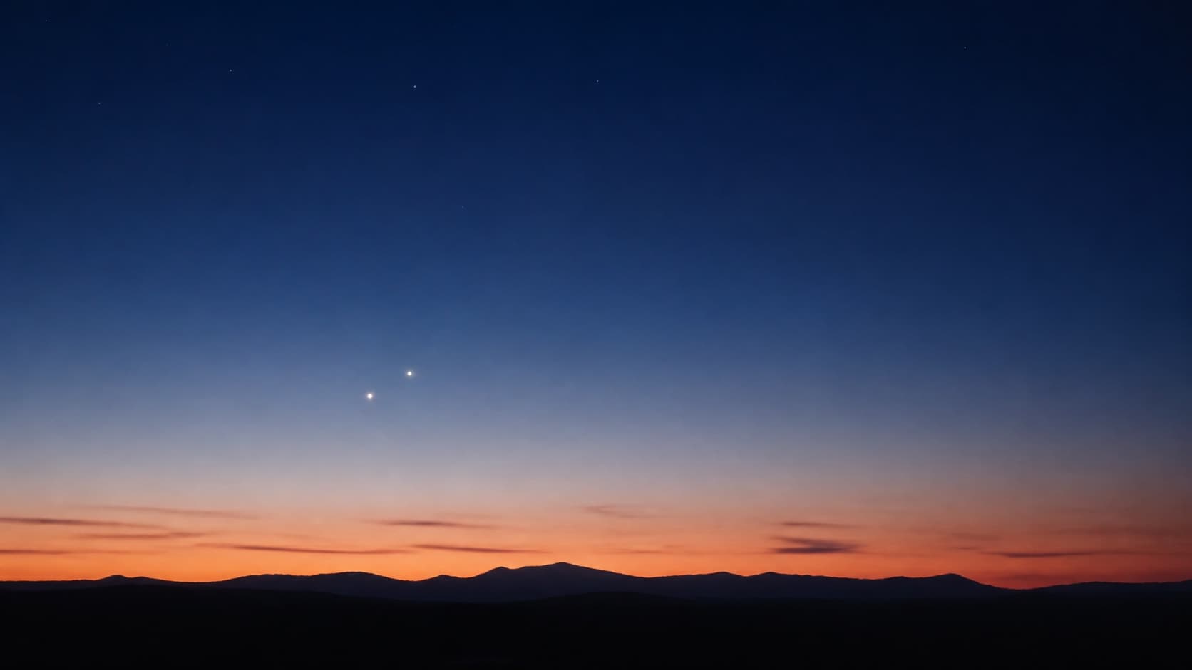
Planets and the moon, marked separately
Stars are one kind of object; planets are another. On a printed star map, planets usually get their own treatment — sometimes a different shape, sometimes a label, sometimes a small ring.
That’s because planets move relative to the stars. Sirius will be in the same spot relative to its neighbors a hundred years from now, but Jupiter will have made roughly eight full laps around the sun in that time.
On your map, the planets are calculated separately and placed where they actually were on your date. Venus, Jupiter, Mars, Saturn, and (rarely) Mercury are the ones you can see with the naked eye, so those are the ones that show up.
The moon, if it was up at your moment, gets drawn in its actual phase — the sliver, the gibbous, the full disk — in the part of the sky it was in. If the moon had already set or hadn’t risen yet, the map omits it.
Reading the text underneath
Below the circular sky, almost every personalized star map carries a small block of text. The exact format varies, but the common pieces are:
- The place name— the city, town, or neighborhood the sky was calculated for.
- The date— often written out long-form (“June the twenty-first, two thousand and twenty-three”), sometimes shorter.
- The exact latitude and longitude— sometimes hidden, sometimes displayed as a small line under the date.
- A custom message— a name, a quote, the time, a short dedication. This is the part that turns “the sky on a date” into “the sky on theirday.”
None of that text is decoration. It’s the metadata that tells anyone looking at the print exactly which sky this is.
A quick test — read your own sky
The fastest way to get fluent at this is to look at the sky for a date you already know about and try to identify the parts.
Plug your own birthday and your birth city into the SkyWhen customizer. The preview shows you the same sky the printed poster would use.
Find the horizon. Find the zenith. Spot the brightest star — was that Sirius, or Jupiter pretending? Trace the Milky Way if it’s visible. Look for the Big Dipper or the Southern Cross.
Then change just the date by six months and watch how everything rotates. That’s the Earth’s orbit, drawn live.
If any of this raised more questions, the broader explainer is in What Is a Star Map?, and the math under the hood is detailed in How Star Maps Work.
The bridge: reading is its own kind of remembering
A printed star map gets richer the more you can read on it. The first time you look at it, it’s a beautiful pattern.
After ten minutes of orienting yourself, it’s a record. You can point to the spot where the moon was, the bright planet low in the south, the constellation that sat overhead.
That shift — from pattern to record — is what makes a star map work as a gift. The first read is decoration. Every read after is memory.
FAQ
Where is north on a star map?
On most Northern-Hemisphere maps, north is at the top of the circle. South is at the bottom, east is to the left, and west is to the right.
The convention is opposite to a road map because a star map is drawn as if you were looking up at the sky, not down at the ground.
Southern-Hemisphere maps usually flip the convention so south is at the top, since that’s where the most-famous southern stars sit.
What does the soft band across the map represent?
That’s the Milky Way — the disk of our galaxy seen edge-on from inside. It’s placed exactly where it actually appeared in the sky on your chosen date and from your chosen location.
The brightness varies depending on the part of the band — the core, near Sagittarius, is much brighter than the rim near Cassiopeia.
Why are some stars on the map drawn larger than others?
Dot size represents apparent brightness, not physical size. A bigger dot is a brighter star.
This is how the eye perceives the sky in real life: bright stars seem to pop, dim stars fade into the background.
Why aren't planets on every star map?
They are, but only if they were above the horizon on the date you chose. If Saturn was below the Earth at your moment, it doesn’t appear.
Planets also move relative to the stars, so they’re calculated separately by the software. On most maps they’re marked with a slightly different symbol or a label.
Can a star map show what you'd see in a city with light pollution?
A star map shows what was technically upat your date and time — not what you could realistically see from a bright city street.
Most personalized maps show stars down to about magnitude 6, which is what a sharp eye can see under a dark country sky. Most city skies only show the top fifty or so brightest stars.
That’s a feature, not a bug. The map captures the sky as it was, before streetlights edit it down.
